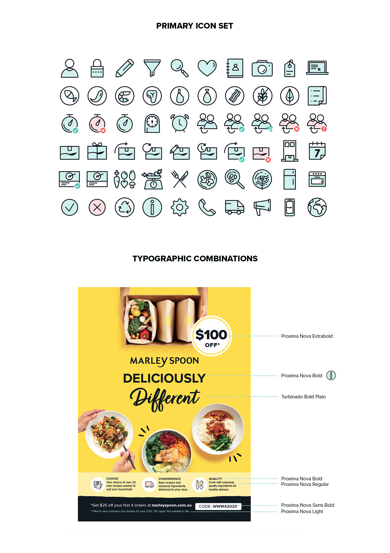
Starting with an audit, we explored both strengths and pain points to the brand and the competitors. We researched the preferences and behaviours of the target audience, followed by a thorough review over the brand's visual elements: colour, logos, typography and iconography.
The result was a set of fresh detailed brand guidelines that allowed flexibility across all touch points, from the App and marketing communications to packaging, ensuring consistency and a human-centred brand experience.